Archiv für den Autor: t_wolfanger

Probabilities of First Round Outcomes in the World Cup

Did you know that there are 40 possible point distributions for a group at the first round of the World Cup? I was wondering how many there are and with what probability they occur. So here are the results of my calculations: There are 729 (3^6) variations of the results of the six matches of the group stage, ignoring the actually scored goals and only considering if the first mentionend team wins, draws or loses.

By ordering the resulting point distribution by the number of points, the results can be reduced to 40 combinations, where the first digit belongs to the first placed team, the second to the second placed etc. There is only one variation, a streak of six consecutive draws, which leads to a point distribution with three points for every team (3333). On the other side, there are 36 possible sequences of match results that lead to the distributions 6443 and 7441.

But which point distributions have the highest probability? Well, that depends on the probability of match outcome. If a victory, a loss and a draw have the same probability, it can be calculated by simply dividing the number of variations for a certain distribution by the number of all possible variations. In case of 6443 this would be 36/729 or 4.94 percent. The assumption that all results occur with the same frequency in very unlikely. To calculate „empirical“ probabilities, I looked at the last five World Cups and counted the number of draws in the first round. 63 of 240 matches ended without a winner. Thus, the draw probability for any match, not having any further information on the competitors, is 26.25 percent. For further calculation, I simply assumed that both teams have an equal winning probability of (1-0,2625)/2.

Take a look at the results:

Possible Point Distributions, Number of Variations, Probabilities and Real Point Distributions (1998 to 2014) for World Cup Group Stage

Number of Variations, Probabilities and Real Point Distributions (1998 to 2014) for World Cup Group Stage

Obviously the point distributions with a higher calculated empirical probability occur indeed more often. Having only included 40 groups since 1998, the distribution lacks of course some smoothness. But there probably is a problem with the assumption of equal winning probabilities too. Since 1998 the two combinations with the highest computed probabilities have only occured once or in 2.5 percent of the included groups, although they should have in 12.4 percent. A reasonable explanation is, that team strength plays a crucial rule in the creation of groups. The highest ranking teams in the FIFA are distributed over all groups, making it likely that their winning probability in every match is higher than assumend for my calculations. Point distributions like 6633 and 6443 are more likely to occur if a group consists of teams with similar strengths. The mode of group drawing makes a strength distribution in favor of these point distributions more improbable.

by Tobias Wolfanger

Das männlichste Studienfach Deutschlands

Die Entscheidung für ein Studienfach ist keine leichte. Es gilt vielfältige Faktoren zu berücksichtigen: Wo kann es studiert werden? Wie sind die Berufsaussichten? Und dann gibt es noch einen Umstand, der vielleicht insgeheim eine Rolle spielen mag. Wie ist die Studierendenschaft meines Wunschstudienfaches im Allgemeinen beschaffen? Oder noch genauer: Wie ist das Geschlechterverhältnis?

Interaktiv ist besser

Ich habe diese Überlegungen zum Anlass genommen dieser Frage mal genauer auf den Zahn zu fühlen. Welches ist eigentlich der männlichste Studiengang Deutschlands? Und welches der weiblichste? Mithilfe der Daten der Studierendenstatistik des Statistischen Bundesamts habe ich eine Grafik zur Veranschaulichung erstellt. Der besondere Clou: Sie ist interaktiv. Zunächst einmal viel Spaß beim Herumklicken.

Auf der logarithmisch skalierten Abzysse des Streudiagramms ist die Studierendenzahl insgesamt abgetragen, auf der Ordinate der Anteil männlicher Studierender. Auf der rechten Seite besteht die Möglichkeit, mit Hilfe von Filtern an der Grafik herumzuschrauben. Der Menüpunkt Fächergruppe bietet die Möglichkeit, nach Fächergruppen, wie Sie auch in der Hochschulstatistik verwendet werden, zu selektieren. Das Auswahlmenü Studienfach erlaubt darüber hinaus, einzelne Studienfächer auszuwählen. Zwei Schieberegler geben die Möglichkeit, nur Studienfächer in einem bestimmten Wertebereich anzeigen zu lassen.

Die als gestrichelte Linien eingezeichneten Mittelwerte geben jeweils die durchschnittlichen Werte aller ausgewählten Studienfächer für die Zahl der Studierenden bzw. den Anteil männlicher Studierender an. Zu beachten ist, dass alle selektierten Studienfächer mit gleicher Gewichtung in die Berechnung dieser Werte eingehen, unabhängig von der tatsächlichen Anzahl der im jeweiligen Studienfach eingeschriebenen Studenten.

Männer aus Stahl

Was ist nun der männlichste Studiengang Deutschlands? Für diejenigen, die es noch nicht selbst herausgefunden haben, es ist, wie könnte es anders sein… STAHLBAU! Mit bombastischen 95 Prozent ist Stahlbau der Studiengang mit dem höchsten Männeranteil. Auf den Plätzen zwei und drei folgen Verkehrstechnik und Feinwerkmechanik. Damit bestätigt sich, was zu vermuten war. Die ingenieurwissenschaftlichen Studiengänge sind die zu größten Teilen männlich belegten. Unter diesen gibt es aber auch zwei eher weiblich geprägte Studiengänge. Mit jeweils ca. 15 Prozent setzen sich Textiltechnik und Innenarchitektur deutlich von den anderen Studiengängen in ihrer Fächergruppe ab.

Frauen in Pädagogik und Medizin

Auch am weiblichen Ende des Studienfachspektrums bleiben die Überraschungen aus, zumindest wenn man gängige Erwartungen darüber pflegt, wo die überwiegenden Interessen von Frauen und Männern liegen. Die Sprachheilkunde/Logopädie landet mit einem Männeranteil von nur 6 Prozent auf dem ersten Platz. Gestaltung (9 Prozent) und Schwerbehindertenpädagogik (11 Prozent) landen auf den Plätzen. Damit gehen zwei von drei Treppchenplätzen an Studienfächer aus der Fächergruppe Sprach- und Kulturwissenschaft (Sprachheilkunde und Schwerbehindertenpädagogik). Im Durchschnitt liegt diese Fächergruppe bei einem Anteil von 31 Prozent männlicher Studierender. Im arithmetischen Mittel der Fächergruppen wird diese jedoch noch von den medizinischen ausgerichteten Fächergruppen übertroffen.

In der Veterinärmedizin, deren Fächergruppe nur ein Studienfach umfasst, liegt der Anteil der Frauen bei 85 Prozent. Die Studiengänge aus dem Bereich Humanmedizin/Gesundheitswissenschaften liegen bei einem mittleren Frauenanteil von 72 Prozent. Innerhalb dieser Fächergruppen weisen die Humanmedizin und die Zahnmedizin mit 39 bzw. 38 Prozent die höchsten Männeranteile auf. Studienfächer die eher im gesundheitswissenschaftlichen Bereich liegen, weisen im Vergleich zu diesen einen höheren Frauenanteil auf.

Findet es heraus

Es ließe sich an dieser Stelle noch einiges über die bevorzugte Studienwahl von Frauen und Männern berichten. Das tolle ist: Ich muss es nicht. Wer wissen möchte, wo sein eigenes aktuelles oder zukünftiges Studienfach im Vergleich zu anderen zu verorten ist, der kann es selbst herausfinden. Viel Spaß beim Herausfinden. Für interessante Entdeckungen, Fragen oder Anregungen steht die Kommentarfunktion offen. Ich freue mich auf Feedback.

von Tobias Wolfanger

Die erste Nullnummer der Saison

Nun ist es doch passiert. Am neunten Spieltag der Bundesliga-Saison trennten sich der SC Freiburg und Werder Bremen mit 0:0 und lieferten damit das erste torlose Endergebnis der Spielzeit ab. Bemerkenswert ist der späte Zeitpunkt der Saison. Noch nie zuvor blieben die Bundesligafans so lange von Nullnummern verschont.

In den bisherigen 50 vollendeten Spielzeiten der Bundesliga kam es 22 mal bereits am ersten Spieltag zum torlosen Unentschieden. Lediglich in acht Saisons wurden drei oder mehr Spieltage abgeschlossen, bevor ein Spiel ohne Tor endete. Spätestens am sechsten Spieltag war es aber bisher immer soweit. Da ist der Sprung auf ganze acht Spieltage ohne 0:0 durchaus der Erwähnung wert. Folgendes Diagramm gibt die Häufigkeiten wieder, mit denen der jeweilige Spieltag der erste mit einem torlosen Spiel in der jeweiligen Saison war.

Spieltag des ersten torlosen Saisonspiels - Häufigkeit

Spieltag des ersten torlosen Saisonspiels – Häufigkeit

Der bisherige Rekord war übrigens fast so alt, wie die Bundesliga selbst. Am 5. Oktober 1963 sorgten der 1. FC Kaiserslautern und Preußen Münster am sechsten Spieltag für das erste torlose Unentschieden der Bundesliga.

von Tobias Wolfanger


Wahlbeteiligung und Zweitstimmenanteil

Morgen ist Bundestagswahl! Im Moment wird viel darüber spekuliert, wie hoch die Wahlbeteiligung wohl ausfallen wird. Um ihrer selbst Willen, als Ausdruck der Legitimation für unsere repräsentative Demokratie, aber auch, weil die Wahlbeteiligung einigen Einfluss auf das Ergebnis haben kann. Zumeist heißt es, die SPD profitiere am meisten von hoher Wahlbeteiligung. Der Zusammenhang ist klar: Die Sozialdemokratie ist die Partei mit dem im Vergleich niedrigsten sozialen Status ihrer Wähler, also in Bezug auf Einkommen und  formalen Bildungsabschluss. Nicht ungewöhnlich für eine aus dem Arbeitermilieu entstandene Partei. Am andere Ende dieser Skala liegen die Grünen und die FDP, die große Teile ihrer Wählerschaft aus dem bürgerlichen Milieu beziehen.

Zahlreiche Studien haben nachgewiesen, dass Einkommen und Bildung einen starken positiven Einfluss auf die Wahlbeteiligung haben. Nicht umsonst hat also die SPD, mich eingeschlossen, in den letzten Wochen intensiven Tür-zu-Tür-Wahlkampf betrieben, um auf die große Bedeutung hinzuweisen, die von der Teilnahme an der Wahl ausgeht.

Ich habe das zum Anlass genommen, um eine kleine Grafik zu erstellen, welche die Stimmanteile der fünf gegenwärtig im Bundestag vertretenen Parteien gegen die Wahlbeteiligung während der letzten fünf Bundestagswahlen abträgt und zusätzlich jeweils eine Regressionsgerade hineingelegt.

Wahlbeteiliugung und Zweitstimmenanteil 1994 bis 2009

Wahlbeteiligung und Zweitstimmenanteil 1994 bis 2009

Auch wenn sich zwischen Bundestagswahlen oft grundsätzliche Rahmenbedingungen ändern und lediglich fünf Wahlen einbezogen wurden, lässt sich eine Tendenz klar erkennen: Den Volksparteien, und hier besonders der SPD, kommt eine hohe Wahlbeteiligung  zu Gute, während die kleineren Parteien höhere Stimmanteile bei niedriger Wahlbeteiligung erzielen können. Klar, bei jeder Wahl gibt es Ausnahmen, aber insgesamt sollte das ein Anreiz sein, dass jeder, der es mit der SPD hält, auch tatsächlich zur Wahl geht.

Zu diesem Thema könnte ich mich sowohl aus politikwissenschaftlicher als auch aus sozialdemokratischer Sicht noch stundenlang auslassen, leider fehlt mir die Zeit und wahrscheinlich wollen das auch nicht allzu viele lesen. Auf Anmerkungen und Fragen in den Kommentaren antworte ich aber gerne.

von Tobias Wolfanger


Inter season correlation – What is the right measure?

I’m happy that I gained a lot of positive feedback for my last post about the inter season correlation as a measure for the stability of football leagues. However, there were also two points of critique, which I want to address in this post, as I thought about both of them before and use them as an incentive to think about the future use and possible improvements of inter season correlation.

r² as a measure of predictability

The first point of critique I was confronted with at reddit is, that Pearson’s r would be a meaningless measure if not adjusted for r². That’s not true. If the argument of predictability is brought into play, as I did, it’s correct that r² is the adequate expression which share of variance can be explained by a correlation. It’s pretty easy to calculate by just squaring r, so it’s hard to see why r should be meanigless. But I admit that for the comparison of predictability of leagues I should have argued with r². The reason I didn’t use it is due to the fact, that I was aware that there might be negative inter season correlations, as they showed up in two early Bundesliga seasons. These would have been invisible otherwise.

Substituting relegated by promoted teams

The second point of critique was, that I didn’t include relegated teams in the calculation of inter season correlation. I must admit that the main factor I did this was lazyness. As you can imagine, it is a hell lot of work to adjust the database for 245 inter season correlations (5 leagues x 50 years). I gathered the data from a few web sources and after correcting some name changes over the course of years, remarkably many of Italian, French and Spanish teams varied their official name over the last 50 years while the English and German teams kept theirs, I used pivot tables to build my database, with team names in rows and seasons in columns. All matching of relegated and promoted teams is handwork as I haven’t found a way to automate this yet. So the exact way to interpret the inter season correlation as presented in the previous post is the Pearson correlation of the rank of teams which didn’t get relegated in the first of the two seasons. 

Spearman or Pearson

Another way to calculate correlations is to use Spearman’s rho instead of Pearson’s r. Spearman has the advantage of being applicable to ordinal data by using ranks instead of metric data. In the case of team ranks of a league’s final table that doesn’t make much of a difference, because ranking ranks will not have much of an effect. Spearman’s rho as a measure of inter season correlation can be interpreted as the correlation of ranks in the order of teams which didn’t get relegated in the first of the two seasons. The small differerence lies in the effect that promoted teams splitting up the phalanx of non relegated teams can have on Pearson’s r, by influencing the mean value, but not on Spearman’s rho.

Comparing the measures

In the following graph I plotted different variations of the inter season correlation for the last 20 Premier League seasons. Not surprisingly there are only minimal differences between Pearson’s r and Spearman’s rho, so it’s more or less irrelevant which one is chosen. But have a look at the correlation coefficients for the case that relegated and promoted teams get matched. (Because all teams are included there is no difference between r and rho anymore.)

Spearman_Pearson_substitution

It seems that it could be worth the effort of doing some handwork. While the coefficients only based on the non relegated teams over the course of 20 seasons have coefficients of variation of 0.25 for Pearson and 0.24 for Spearman, the inclusion of all teams leads to a value of 0.16. The result is a smoother line with much smaller changes from season to season.

Conclusion

Including all teams by replacing relegated with promoted teams seems to be a good idea, but it is a lot of work. Looking at shorter period of time the effort is definetely worth it, but the effect on the overall trend is rather small. All measures suggest that the inter season correlation of the last Premier League seasons have been on an incredibly high level. Including all teams, the correlation coefficient between 2011/12 and 2012/13 is 0.76 with r² = 0.58. That means that 58 percent of the variance of the 2012/13 table can be explained by the order of the 2011/12 table.

by Tobias Wolfanger

How stable are Europe’s Football Leagues?

After a preceding post that showed that the trend in Europe’s top flights is going towards greater unequality regarding the share of wins, I decided to take a similar approach in analyzing the degree of revolution the European leagues experience from season to season. The most important column of a last matchday’s football league table is neither the number of points earned nor the number of scored and conceived goals. At the end, the only thing that matters is the final rank of a team. All important decisions for a team’s athletic and economic furture depend on its position in the table. Those at the bottom get relegated, the first teams can call themselves champions and the following teams at least have the great opportunity to participate in European competitions.

So what did I do? I collected the final tables of the last 50 seasons of the German, English, French, Italian and Spanish top leagues and calculated the correlation between the rankings of teams in two consecutive seasons. (Due to the fact that some teams get relegated each year, the calculated correlation is only valid for the selection of teams that were members of the league for two consecutive seasons.) Ranging from -1 to +1, the resulting coefficient Pearson’s r gives an impression how much movement a league has experienced over the course of one season. A perfect positive correlation of 1 means, that the order of teams in the final tables has been perfectly stable. Hence a team’s position in one season would have been a perfect predictor for next one. In contrast, a perfect negative correlation of -1 means, that the previous season’s table has turned upside down. Pearson’s rs around 0 indicate, that there is no connection between two seasons at all.

The two main expectations are, that there is a strong inter season correlation in team’s rankings over the whole examined period with increasing positive correlations in recent years. As we will see, the first holds true for all leagues. With the exception of two Bundesliga seasons in the late 1960s, only positive correlations can be found. The second hunch makes a deeper look necessary. It seems that not all leagues are moving in the same direction.

Bundesliga (Germany)

Min.: 0.03 – 1st Qu.: 0.49 – Median: 0.65 – Mean: 0.63 – 3rd Qu.: 0.78 – Max.: 0.87 – SD: 0.22

The Bundesliga is becoming more and more popular all across the football world. A big part of the growing admiration is due to its greater competitiveness compared to the English Premier league or La Liga. As the following graph depicts, two of the last three seasons have shown a remarkable extent of rotation in the league’s tables with only a slightly positive correlation. Imagine what this means: During both seasons Borussia Dortmund won the trophy, the table of the previous season wouldn’t have given you hardly any clue about the final ranking of teams. Maybe these two were rather exeptional ones, with the season 2012/13 returning to a level that is within the range of reasonable expectations which the seasons of the later 2000s set. So probably the last season with Bayern Munich raising the Meisterschale is an example of regression to the mean.

Inter season correlation Germany

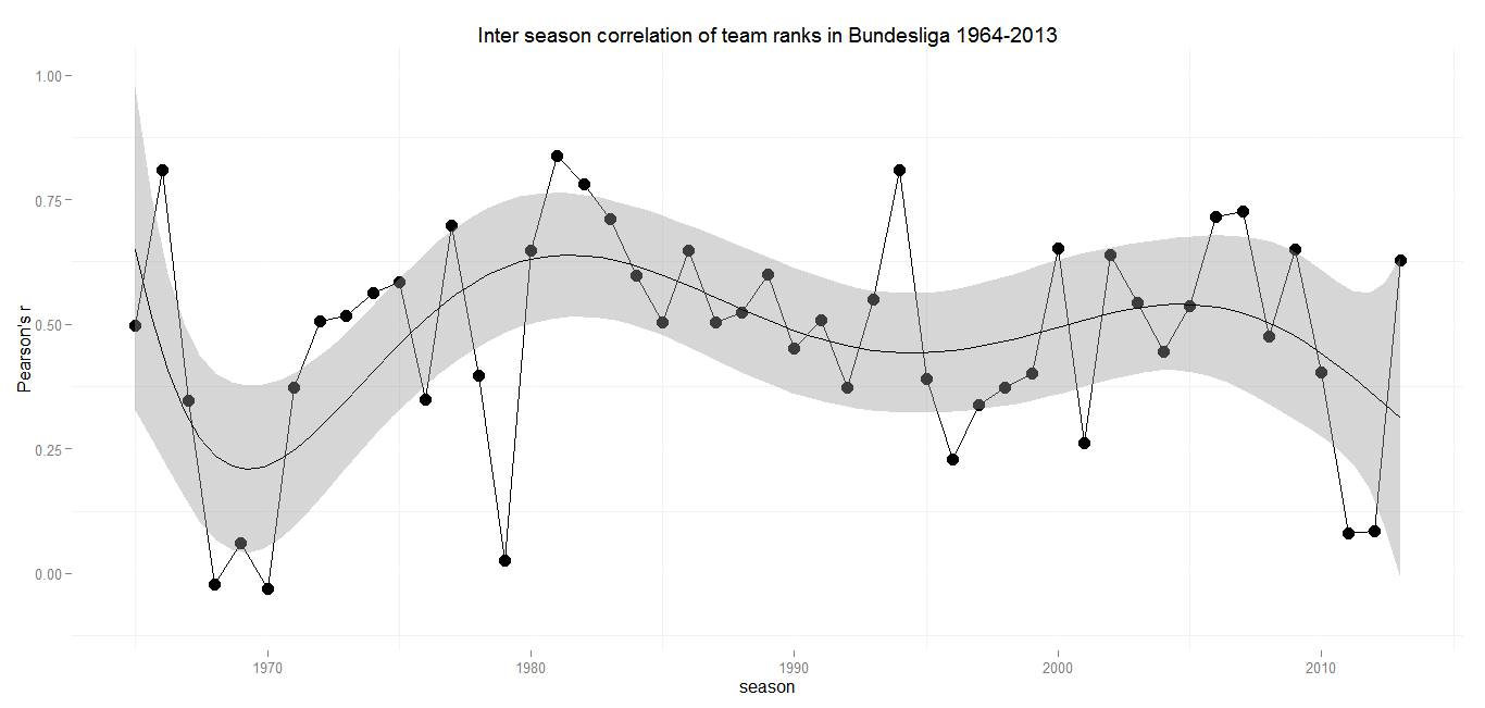
After the formation of the Bundesliga in the 1960s there have been some years with big movements in the final tables. But with the beginning of the 1970s the Bundesliga settled a a level of medium to strong correlation between the years. There are a few outliers over the course of 50 years, but in general the sixth degree polynomial I used to smooth the graph makes a pretty good fit.

The only season extremely out of range is 1978/79. A little online recherche might deliver an explanation for the vast revolution the Bundesliga experienced at this time: The winter 1978/79 was extremly strong, but a winter break wasn’t introduced until 1986. Heavy snowfall lead to the cancellation and postponement of not fewer than 46 matches. The lack of playable football fields caused that some clubs didn’t play at all for months from december to march. You can get an impression of the situation in this clip from the Sportschau. So the outside conditions might have had some effect on the final table. What surprises is, that the following season delivered a final table with a comparatively strong correlation to its exeptional predecessor, which suggests, that a relatively stable order of teams emerged from that season. This can have happened more or less by chance, but I’d be very glad if someone comes up with a better explanation.

The stable repetition of  medium sized positive correlations until the recent years shows, that the Bundesliga always left some room for ascending teams. It will be interesting to see, if last season’s rather strong positive correlation is marking an upward trend, a regression to the mean or an outlier in a league that is becoming more competitive.

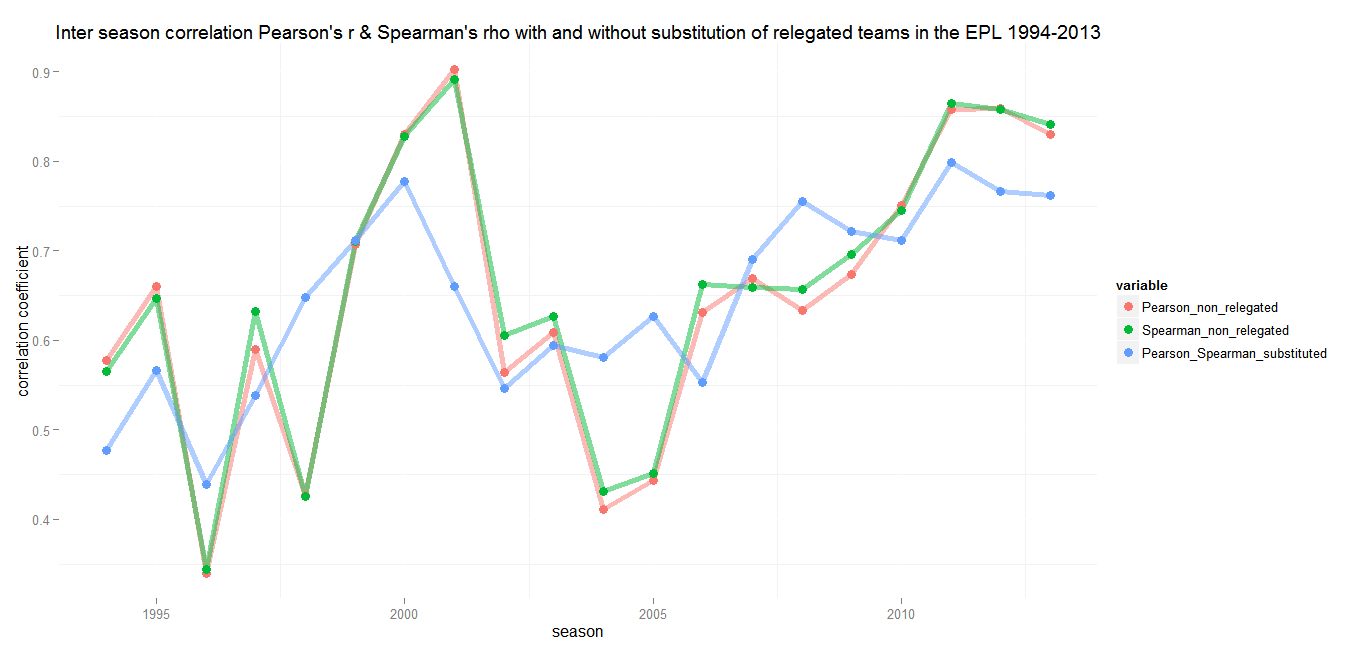
Premier League (England)

Min.: 0.23 – 1st Qu.: 0.45 – Median: 0.59 – Mean: 0.57 – 3rd Qu.: 0.67 – Max.: 0.90 – SD: 0.17

If you are looking for a football league that is hard to predict, you should probaly stay away from the English Premier League. Until the early 2000s the Premier League and its predecessors have delivered pretty constant medium to strong correlations. There were some ups and downs, but remarkably the weakest correlation in a period of 40 years is 0.23 in 1976/77. While other leagues had some extraordinary, almost revolutionary seasons, the First Division and Premier League tables always had a decent predictive power for the following season.

Inter season correlation England

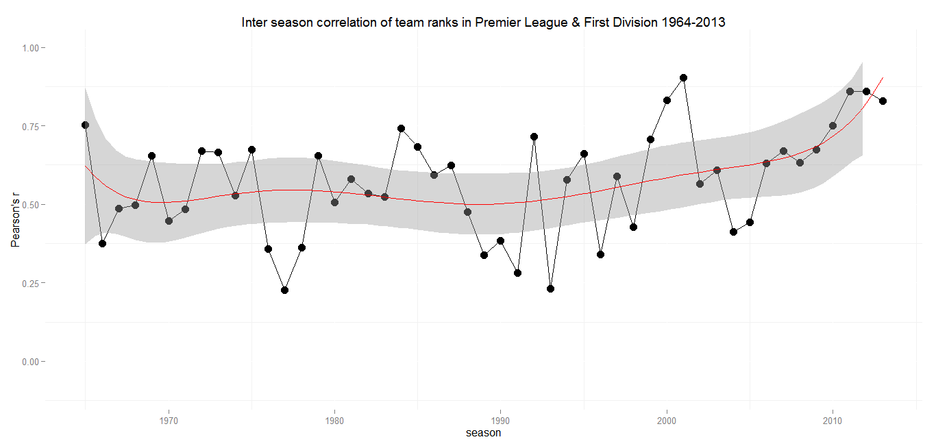
The late 1990s and the early 2000s saw a heavy increase in correlation, culminating in 2000/2001 (r = 0.90), where the final league table was almost an excact copy of the season before. Until 2004 the Premier League became more but not completely unpredictable again. Since then there has been an almost steady increase with almost no decline inbetween. That wouldn’t be as alarming, if there were any hints for an inverting trend somewhere in the future. But in contrast to seasons with strong positive correlations in the previous decades, the recent ones were not followed by a modest or sharp decline. The last three seasons each had a correlation above 0.8 with their forerunners. There is not much room for speculation how a team will perform in the upcoming season anymore.

Ligue 1 (France)

Min.: 0.05 – 1st Qu.: 0.29 – Median: 0.44 – Mean: 0.42 – 3rd Qu.: 0.52 – Max.: 0.82 – SD: 0.18

Like the Bundesliga, the French top flight seems to have gone through different phases, but it’s hard to detect patterns. The most remarkable thing about the League 1 and its predecessor División 1 is, that with r = 0.42 it has the lowest mean correlation of all European top leagues.

Inter season correlation France

The last seasons have seen Pearson’s r at a moderate level.  With the Ligue 1 rather a second tier league in European comparison, lets see what happens when the oligarch’s money keeps rolling in.

Serie A (Italy)

Min.: 0.03 – 1st Qu.: 0.49 – Median: 0.65 – Mean: 0.62 – 3rd Qu.: 0.78 – Max.: 0.87 – SD: 0.19

The overall trend of the Serie A league tables correlation resembles that of France, but on a much higher level, with a mean correlation of 0.62 and a first quantil at 0.49. That means that more than 75 percent of Serie A seasons have a higher inter season correlation than the average Ligue 1 or Bundesliga season. Serie A shows extremly stable correlations over the last 50 seasons, with the exeption of two years.

Inter season correlation Italy

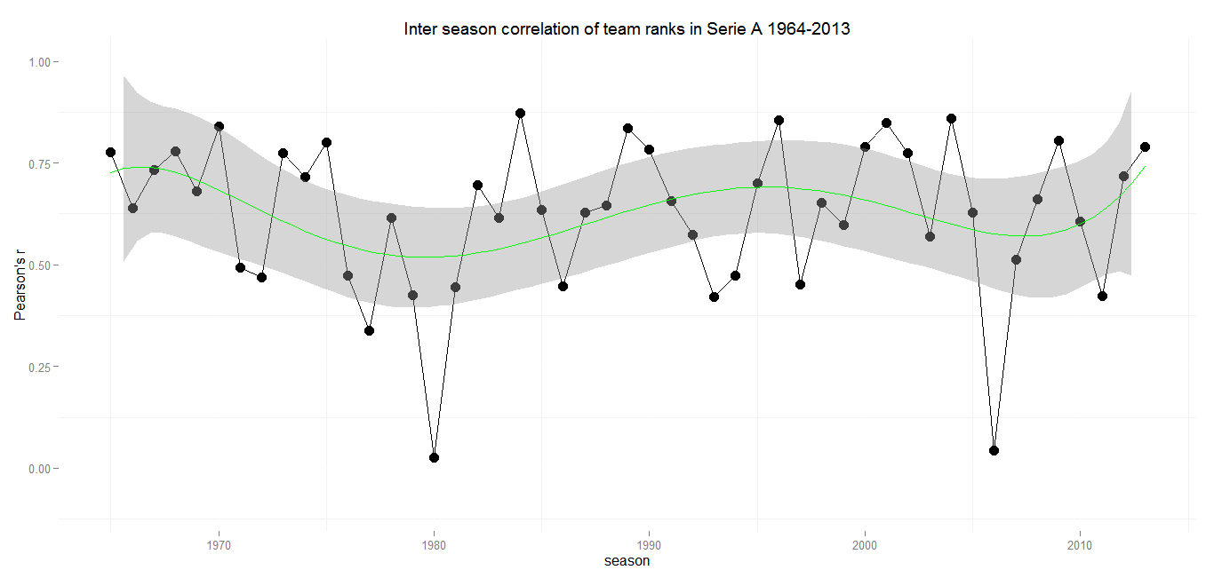
In an otherwise stable league environment both dents are explainable by match fixing scandals and the resulting punishments. The season of 1979/80 saw Milan and Lazio relegated to the Serie B due to the Totonero scandal. A few other teams were deducted five points in the following season without any bigger impact of the final classement.

The dent in 2005/2006 is owed to another sad episode of Italian football. The punishment for the fixing of matches lead to the relegation of Juventus FC and the deducement of points for Milan, Lazio and Fiorentina with an enourmous impact on the final table. The sentence included deducement of points for the latter ones and Reggina in the following season as well, but the league returned to a regular level of inter season correlation.

Justitia seems to be the only one to ramble up the Serie A.  But there is also a good thing to say about Italian Football: They had a strong regular correlation between seasons even before the big commercial times in football began. If it wasn’t for the scandals, the trend would almost be a straight line, like in Spain.

Primere División (Spain)

Min.: 0.34 – 1st Qu.: 0.49 – Median: 0.60 – Mean: 0.60 – 3rd Qu.: 0.67 – Max.: 0.91 – SD: 0.13

If there hadn’t been the Serie A scandals, Spains top flight would have been the one with the  strongest average inter season correlation (0.60). With an incredible r of 0.91 in 1994/95 and 0.34 in 1987/88 La Liga holds the record for the highest maximun and minimum values. It also has by far the smallest standard deviation over the last 50 seasons.

Inter season correlation Spain

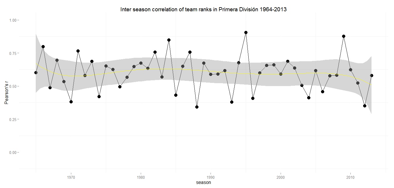
Despite only two teams competing for the trophy every year, there obviously is at least some room left for the ascent and decent of other teams. Currently at least more than in Italy or England. If there is this often complained about lack of competiveness, it is to seek at the top of the league.

Conclusions and future expectations

A mere look at the inter season correlation presents the picture of La Liga and Serie A conducting as they have done for the last half century and probably will in the future, with medium to strong correlations each year. It’s harder to make predictions for Bundesliga and Ligue 1. Bundesliga’s downward trend with regards to the correlation of club rankings in recent years is due to two extraodinary seasons in the last three years. The current season might give us a clue in which direction it will develop. For the traditionally volatile Ligue 1, an important factor could be the amount of money that flows into the system and whether it will only be targeted at two clubs.

Here lies a weekness of the approach undertaken in this post. The correlation of a league’s two conscecutive seasons may give us an idea how much movement can be expected from year to year, but doesn’t tell much about in which areas of the table there is the most rotation. Because it does’t take into account the point difference between two neighbouring teams, it gives us little insight how close the race for the national title has been.

As the Spanish example shows, inter season correlation can’t express what’s happening at the top. It doesn’t show that the only two serious contenders for the title are Barcelona and Real Madrid. The situation in the Premier League is different. With both Manchester clubs, the London sides Chelsea, Arsenal and Tottenham and Liverpool having nested themselves in a comfortable way at the top of the league, there is not much room left for surprise teams or rotation at all. But on the other hand there are more than just two teams with at  least resonable odds for a bet on them winning the championship. The question is, which option is more attractive for observers of a football league. A very stable league with more contest at the top but not much movement at all or another one with an extremely stable top but some competition from the third rank downwards.

Please feel free to tell me your opinion in the comments section or contact me on Twitter.

by Tobias Wolfanger

Scraping Web Data with Rapidminer

After my last post about the chracteristics of Bundesliga players‘ body data by position I have been asked whether there is a relationship between the height of players or teams and their tactics on the field. For example, is a team with taller forwards more likely to make use of crosses and headers to score? While I’m still working on this topic, I thought it would be nice to show how I build a dataset of all Bundesliga goals in the past season to answer this question.

So here is a short introduction to scraping web data with Rapidminer. My goal: Build a dataset including all goals of the last Bundesliga season including additional information such as the kind of assist which preceded it. A good data source is Transfermarkt.de, which offers a game sheet for every match.

For a few matches, the relevent data can be extracted by hand. The problem arises when you plan to collect data for a whole season. So here is how I did it, step by step.

Preparing a list of websites to scrape

  1. The first thing to do is to build up a collection of pages that contain the information you’re looking for. Transfermarkt offers a season overview containing all matches and links to their respective game sheets.
  2. The next step is to view the source code of the the page which contains all the links.
  3. Copy the html-code to Excel or any other spreadsheet application.
  4. You’ll realize that you’ve copied thousands of lines of code. In this case only 306, the total sum of matches per season, are of interest. A good procedure to separate the lines containing valueable information is to sort the whole table document. Having a unique structure, the relevant lines will be concentrated in one section, while all others lines can be deleted.
  5. When only the relevant lines of code are left, the next step is to separate the relevant links from the remaining html-structure. A good way to do this is to use quotation marks as separators.
  6. Having deleted all irrelevant columns, the last step is to add the domain name common to all links in front of them, in this case „www.transfermarkt.de/“ In Excel you can merge strings by using „&“. The result is a list of all html pages to scrape which can be used in Rapidminer.

Scraping with Rapidminer

From here on I assume, that you have a basic understanding how Rapidminer works and how processes can be designed. So I won’t start with the absolute basics. If you don’t have already, you should now install Rapidminer along with the newest version of the webmining package.

At the end, your main process should look like this:

  1. After having opened a new project in Rapidminer, the first thing to do is to make use of the „Read Excel“ operator. It will read the link spreadsheet line by line and submit the websites to the following operator. All operators can be searched in the operators section on the left side. In the parameters section on the right you only have to provide the path to your file and the information whether the first row contains headlines. The import wizard provided should be useful. Important: Make sure the attribute of the variable containing the links is set to „file path“.
  2. Next you have to add the „Get Pages“ operator to your process and connect it to the „Read Exel“ operator. The only thing to do here is to define the name of column wich contains the links in the spreadsheet.
  3. The third operator to use is „Data to Documents“. Connect it to the output of „Get Pages“.
  4. Connect the document output to the „Process Documents“ operator. It is important that the keep text option is checked. Otherwise there will be no text to extract the data from.
  5. Double click on the „Process Documents“ operator. You now are at a lower level where you can set the nested operations that will take place within the „Process Documents“ operator. The operators combined inside should look like this afterwards:
  6. First operator in here is „Extract Content“ which separates text and html tags. The minimum text block length defines how long the extracts (tokens) have to be at least. You should set the length depending on the the content you want to extract. If you set it to one, all text will be extracted.
  7. This step is optional. You can use the „Filter tokens“ operator to decide wich pieces of text you want to keep. You can determine tokens to keep by giving the operator a string by which it is filtered. The standard setting is that tokens containing the defined string are kept. But there is also the possibility to invert the filter by selecting the checkbox in the parameters section. I used this to exclude all social media text like „share on twitter“ etc. But this can be done later as well.
  8. The next step is optional too. With the „Cut Document“ operator you can cut your text in parts by selecting strings as starting and ending sequences. The use of this operator makes sense, if you are only interested in a particular part of the text. If a text is well structured, like the game sheets on Transfermarkt.de, every type of information will be found in it’s own section. For example all information of a match’s goals are available between its own header „Tore“ („goals“) and „Wechsel“ („substitutions“) as the header of the next block of information. If you apply this operator, only text between the matching strings will be kept. It is possible to define a great number of matching strings. In the resulting data set each extracted section can be identified by  the name you labeled it with.
  9. Now you can return to the main process. The final step here is to connect the output of the „Process Documents“ operator to the „Write Excel“ operator. Select a directory and a document type, and Rapidminer will write your dataset in an Excel file.

Data Jiu-Jiutsu

The rest of the work can be done in Excel again.

  1. Depending on whether you cut one or more sections from the text, your dataset will contain the number of cut section X the number of pages you scraped. By sorting the spreadsheet by the label (query key attribute) assigned to each different section, you can easily select the ones you want and copy them to another table.
  2. The last steps to create your data set is data jiu-jiutsu. Everybody has different ways to handle it. In my case, I had to think a while before I realised what might be a good solution to get my data in shape, because there where no separators in the text to distinguish goal events.  Finally I substituted all score information of goals by simply adding a leading comma. For example „0:1“ was converted to „,0:1“. By just adding a comma for every „digit-:“ combination. This was done within a minute. The rest is a lot of reshaping.

I hope this tutorial will be useful to somebody, If there are further questions, don’t hesitate to ask them in the comments section.

by Tobias Wolfanger

Body Data of Bundesliga Players by Position

As promised last week, here’s my follow up post with a look at the body data of Bundesliga players according to their positions. I aggregated the data I collected from whoscored.com last week and calculated the average age, height, weight and BMI for each position.

The difficulty of an analysis by position arises from the natural fact, that some players can and do play on more than just one position or at least some variation of it. 163 out of 546 players in the data set have played at least two different positions during the past season. Therefore it is necessary to determine how to deal with this noise in the data. Aggregating data on a higher level would not be a good solution. Imagine summarizing centre backs (D(C)), left (D(L)) and right backs (D(C)) into one position: Putting together lively full backs and heavyset center backs would ruin a lot of the expected insight.

So what did I do about it? If a player played more than just one position in the last season, I made a duplicate entry for each position played. So if for example Thomas Müller played as an offensive midfielder in the center, left and right and as a forward, he has four entries in the data set which I used for analysis. I also removed those players from the data set, who were members of a team, but didn’t have any appearences on the field. So all results presented in the following diagrams can be interpreted as the mean values for body data of players who had at least one appearance on the respective position in the past season. The data set used for the analysis can be downloaded here.

Age and Position

Looking at the following diagram, the reader might ask why midfielders (M) and defenders (D) are much younger on average. This is more a less a statistical artifact due to the fact that the database at whoscored.com isn’t able to further specificate the position for players with few appearances. Therefore the players summarized under these positions are mostly younger ones. The same is true for forwards (FW), but there is no further specification for their position (center, left or right).

Over all, there is not a big difference regarding the age by position. Besides goalkeepers (GK) being the oldest on average, there might be a slight tendency to staff the more defensive positions with older players. Maybe this is where routine comes into play. We all know that a single defensive mistake can often have a more serious effect on the result than those in the opponent’s half of the field.

Average Age of Bundesliga Players by Position in Years

Average Age of Bundesliga Players by Position in Years

Goalkeepers are the tallest on the field

As I suggested in my last post, goalkeepers are indeed the tallest on average. They also have the highest mean weight and BMI. This is not surprising if one considers their job to keep their goal clean. Some extra centimeters make it much easier to block a higher share of shots coming towards them. Some extra weight, as long as it has no effect on their ability to reach the farest corners of the goal, can help them to dominate their six-yard-box.

Average Height of Bundesliga Players by Position in cm

Average Height of Bundesliga Players by Position in cm

Heavyweight in the Penalty Box

Their men in front, the centre backs (D(C)), are the second tallest and heaviest on the field. With regard to the height of their natural opponents, a decent height is necessary for the upkeep of air dominance. Forwards are smaller and lighter than centre backs, but surmount all other positions. They seem to have the body requirements to hold against the defenders in the penalty box. So it doesn’t surprise, that players deployed as defensive midfielders (DM(C)) are the next tallest and heaviest.

Average Weight of Bundesliga Players by Position in kg

Average Weight of Bundesliga Players by Position in kg

Midfielders and Full Backs

The left and right backs are smaller in comparison to their centre back colleagues, with an average height and weight that resembles the body data of midfielders. Differences between the various positions in the (attacking) midfield and full backs are marginal. Similar physical requirements such as speed or technical skills might be a reason for that and an explanation why many full backs are deployed as attacking midfielders and vice versa from time to time.

Average BMI of Bundesliga Players by Position

So what can we get out of this analysis? At least there seems to be a connection between the physical appearance of a professional football player and the positions he’s playing. So I’m pretty sure now why I spend almost all of my football „career“ as a defender. Not to mention that reflexes like a railway crossing gate didn’t give me a chance to aim at the goalkeeper’s position.

by Tobias Wolfanger

Body Data of Bundesliga Players and Average Germans

So recently I came across that wonderful website whoscored.com, which offers a great database with a lot of player and team data far beyond the information usually available. Having dealt with football data on the aggregate level of leagues before, I thought it might be a good idea to take a closer look on some features to gain some insights on the micro level of the game. So here I am, digging into some of the data I scraped from the website.

Wondering which hypothesis I could go after, it crossed my mind that I could start with the basics. What can be said about the body physics of professional football players? How can they be compared to the German average?

I plotted weight and height of all the Bundesliga players and enriched the diagram with additional lines representing the edges of Body Mass Index (BMI) zones. The BMI is calculated by dividing the weight in kg by the square of the height in meters. It is used to measure the physical condition of people or societies under consideration of their height.

Height and Weight of Bundesliga Players in the season 2012/13 with BMI zones

Height and Weight of Bundesliga Players in the season 2012/13 with BMI zones

Marco Reus, you and me

Not surprising there is a strong correlation (Pearson’s r = 0.82) between height an weight, with an average of 183.7 cm and 78.6 kg. Compared to the average male German, Bundesliga players are more than 5 cm taller (1.78 cm) and nearly 5 kg lighter (83.4 kg), if the whole male population is included. These metrics are of course biased, because older people tend to be smaller and heavier, at least until they get into their 60s. The following table compares the physics of Bundesliga players to average German males in their respective age groups. The data are from chapter four of Statistisches Jahrbuch 2012.

omparison of height, weight and overweight percentage of Bundesliga players and average German males

Comparison of height, weight and overweight percentage of Bundesliga players and average German males

While there is almost no difference regarding the weight of both groups, the professional players tend to be a few centimeters taller. In the group of the players between 30 and 35, the difference is 6 cm. The main reason for this: More than 22 percent of the players in this age group are goalkeepers who tend to have a longer career and are taller than other players.

Regarding the BMI, the majority of players is located in the normal weight zone with a tendency towards the upper edge. According to the BMI criteria, only a few players can be classified as slightly overweight. It’s improbable that any of them are fat. I think the more plausible reason some of them are hitting the overweight zone is their high share of muscle tissue. The BMI doesn’t make any any differences between fat and muscles. Compared to average males, the percentage of overweight football players is rather small.

The final conclusion this far: Bundesliga players have average weight for their age groups, but are slightly taller. Only a small share of them is overweight by BMI criteria.

What else can be done with body data?

As the goalkeeper example has shown, some positions seem to have special demands for the body measurements of players. I’ll soon write a follow up post that will deal with this relation. Finally there probably is also a connection between average body height an the performance of teams. Have a look at this blog post by Chris Anderson which suggests a strong correlation between the average height of a population and the FIFA coefficient of its national team.

by Tobias Wolfanger